Design Trends · 5 min read
2027 Branding Trends: What's Emerging and What Actually Matters
Observations separated from speculation. What is visibly changing in brand work now — and what matters regardless of which trend holds.
Covenant Label Designs — Brand Strategy & Creative Studio · Oct 26, 2026

Trend writing has a credibility problem, because most of it is prediction dressed as observation. Nobody can reliably tell you what branding will look like in two years. Anyone can tell you what is already happening in the work being made right now.
So this is a split document: first what we can observe, then what it might mean, clearly labeled. The distinction matters — one is evidence, the other is a bet.
What is observably changing
These are patterns visible in current work, not forecasts.
Warmth is replacing clinical minimalism
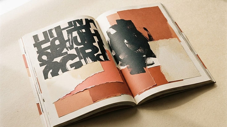
The all-white, thin-type, cool-gray interface that dominated the 2010s is losing ground. In its place: warm neutrals, paper tones, uncoated textures, and typography with more optical weight. The shift appears in both digital product design and consumer branding, and it reads as a reaction against screens that feel identical.
Observation: brands are choosing surfaces that suggest material reality — vellum, stone, linen, kraft — even when the output is purely digital.
Typography is doing the work a logo used to do
Wordmarks and expressive type are carrying more identity weight, particularly in categories where a symbol would be forgettable. Custom or heavily modified typefaces, variable fonts that shift weight across contexts, and editorial-scale headline treatment are increasingly the primary identity asset.
Observation: fewer new identities lead with a standalone mark; more lead with a typographic voice.
Identity systems are built to move
Static lockups are giving way to systems designed for motion and variance: marks that animate, layouts that rearrange, color that shifts by context or data. This is driven by the reality that most brand impressions now occur in feeds, where stillness loses.
Observation: brand guidelines increasingly include motion principles and flexible grid rules rather than fixed logo placements.
Editorial structure is migrating into commerce
Magazine conventions — full-bleed imagery, generous white space, oversized captions, section numbering, deliberate typographic contrast — are appearing in e-commerce, B2B sites, and product pages. The intent is to slow the reader down and signal that a human made a decision.
Observation: more brands are using a publication model (essays, features, point-of-view content) as the frame around their products.
Restraint on claims, more on evidence
Partly a response to skepticism, partly to regulation: fewer superlatives, more specifics. Case studies with numbers, named clients, documented process. Brand voice is shifting from confident assertion to demonstrable proof.
Observation: the strongest current work sounds like a competent person explaining what they did, not a billboard shouting.
What might follow — labeled as speculation
Treat everything below as a hypothesis with a shelf life.
Speculation 1: texture becomes a differentiator again. As generation tools make flawless surfaces abundant, imperfection may become a signal of human involvement. Visible grain, hand-drawn marks, letterpress artifacts, and deliberate irregularity could function as proof of authorship.
Speculation 2: identity systems gain a second, machine-readable layer. Brands may increasingly maintain a structured description of themselves — tone rules, image constraints, claim boundaries — that both humans and automated tools work from, because so much content is produced semi-automatically.
Speculation 3: fewer, longer-lived identities. If attention is saturated, the advantage may shift from novelty to endurance. That would mean less frequent rebranding and more disciplined application of fewer ideas.
Speculation 4: local and physical reassert. As digital surfaces converge, physical and hyper-local signals — a real storefront, a neighborhood presence, a piece of apparel — may carry disproportionate credibility.
None of these are safe to build a five-year plan on. All of them are worth watching.
What actually matters, regardless of trend
Trends are inputs to decisions, not substitutes for them. Five things matter more than any aesthetic cycle.
1. Clarity of position
A brand that cannot state who it serves and why it is chosen will look trendy and communicate nothing. No visual direction fixes that.
2. Distinctiveness within the category
The relevant comparison is not "is this modern?" but "does this look like the other eight options this buyer is considering?" Category conventions exist for a reason and should be broken deliberately, not accidentally.
3. Recognition at small sizes
Most impressions are small: a feed thumbnail, a favicon, an avatar, a search result. Any identity must survive that scale, which is a constraint that eliminates a great deal of fashionable work.
4. Durability versus cost of change
A trend-driven identity needs replacing in three years. Replacing an identity is expensive — not mostly in design fees, but in reprinting, re-signing, re-photographing, and re-educating. Choose the lifespan deliberately.
5. Accessibility
Contrast ratios, legibility at small sizes, motion that can be disabled, color that does not carry meaning alone. This is now a legal and commercial requirement, not a nicety, and it quietly rules out several fashionable palettes and type treatments.
How to use trends honestly
Three rules that keep trend awareness from becoming trend dependency.
Borrow trend energy in campaigns; keep identity decisions on a longer horizon. A seasonal campaign can be of its moment. The logo, palette, and type system should not be.
Ask what problem the trend solves. Warmth, texture, and editorial structure are all responses to a specific condition: digital surfaces feeling indistinguishable. If your brand's problem is different, the trend may be the wrong tool.
Test against your buyer, not your feed. Designers notice trends years before buyers do, and buyers rarely choose a business for being current. They choose it for being credible.
The honest summary
What is observable: warmth, typographic identity, motion-ready systems, editorial structure, and evidence-led voice.
What is speculation: everything about 2027 specifically.
What actually matters: a clear position, expressed distinctively, recognizably, durably, and accessibly — applied with discipline for years. That combination has never been fashionable and has never stopped working.
Key takeaways
- Observable now: warmer palettes, typographic identity, motion-ready systems, editorial structure.
- Predictions are bets, not evidence — build plans on what is visible, not what is forecast.
- Clarity, distinctiveness, small-size recognition, and accessibility outlast any trend cycle.