Design Trends · 5 min read
Why Texture, Typography, and Color Are Reshaping Modern Brand Design
Three tools moved from decoration to identity. How material texture, editorial type and intentional color systems carry a brand now.
Covenant Label Designs — Brand Strategy & Creative Studio · Sep 21, 2026
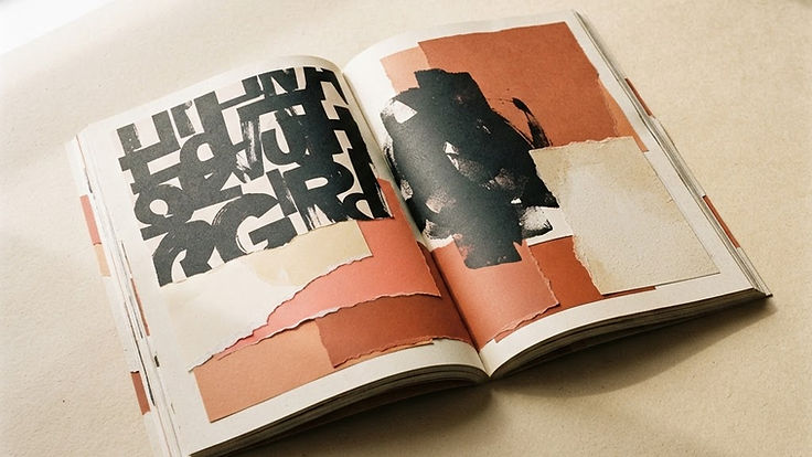
Three tools are quietly reshaping how brands look: texture, typography, and color. None is new. What has changed is their role — from decoration to the primary carriers of identity.
The reason is practical. As logo marks converge and templates proliferate, the elements that survive scrutiny are the ones that require a real decision: how a surface feels, how type speaks, and what a color actually does.
Texture: the return of material
For a decade, design chased the absence of surface. Flat, untextured, infinitely scalable — the aesthetic logic of a screen.
That logic has run out. When everything is smooth and identical, smoothness stops communicating craft. Texture is coming back because it reintroduces the sense that a human or a physical process touched the thing.
Where it appears:
- Paper and print artifacts in digital design — grain, fiber, deckled edges, visible ink absorption
- Photography with retained imperfection — film grain, natural light falloff, slight softness
- Background surfaces that read as material: plaster, stone, linen, kraft, uncoated stock
- Typographic details that suggest physical origin — letterpress impression, overprint, halftone
Two practical cautions. First, texture is expensive to do well: a bad grain overlay looks like a filter, not a material. Second, it must not compromise legibility. A texture behind body copy is a defect; a texture behind a headline at high contrast is a decision.
The best test: remove the texture and ask whether the design loses anything. If not, it was decoration. If the surface suddenly feels sterile and generic, texture was doing real work.
Typography: the identity asset
Type is the most efficient branding tool available, because it carries both meaning and mood in every single application.
Three current movements:
Expressive display type as the mark. Rather than a symbol, the wordmark itself is the identity — custom letterforms, unusual proportions, deliberate optical correction. This works because type appears in every asset automatically, whereas a mark often gets dropped.
Editorial contrast. Pairing a high-contrast display face with a utilitarian body face, borrowing from magazine design to create hierarchy that feels considered rather than conventional.
Variable and responsive type. Type that shifts weight, width, or optical size across contexts — a lighter treatment for dense interfaces, a heavier one for headlines at small sizes. This is a genuine craft improvement, not a trend, because it solves a real problem: legibility at scale.
What this means for brand decisions: choose typefaces for their behavior at the smallest and largest sizes you will use, not from a specimen image. Check the numerals, the punctuation, the diacritics, and the italic if you plan to editorialize.
Typography is also the fastest route to distinctiveness on a budget. A distinctive typeface system costs far less than custom illustration and does more work.
Color: a system, not a palette
Color has moved from "pick three brand colors" to "define an intentional color system," which is a different discipline.
An intentional system specifies:
- A dominant color carrying recognition
- Supporting neutrals that do most of the daily work
- One accent for action — the color of a button, a link, a call to action
- Usage rules — how much of the surface each may occupy
- Accessible pairings — which combinations meet contrast requirements, documented in advance
The mistake most brands make is treating color as a set of swatches rather than a set of ratios and relationships. A palette where every color is allowed everywhere produces visual noise; a palette with hierarchy produces identity.
Two further notes. Warm neutrals — sand, clay, bone, ink rather than pure black — are replacing clinical whites and grays, largely because they photograph better and feel less generic. And color accessibility is no longer optional: text contrast, colorblind-safe distinctions, and never relying on hue alone.
Why these three converge
Texture, typography, and color all operate on the same principle: they are system-level decisions, not asset-level ones. Get them right and individual assets almost design themselves. Get them wrong and every new asset requires a negotiation.
They also converge in what they signal. A brand that uses a considered paper tone, a specific typographic voice, and a disciplined color ratio looks like an organization with a point of view — before a single word is read. That impression is doing commercial work.
Applying this to a real identity
A practical sequence for a small or mid-sized business:
- Choose the typographic voice first. It is the most load-bearing decision and the hardest to change later.
- Set the neutral base. Decide the surface: warm, cool, paper, ink. This determines the overall temperature of the brand.
- Choose one recognition color. One, used consistently until it becomes associated with you.
- Choose one action color. Often the same as the recognition color in a lighter or darker form.
- Define texture as a rule, not an effect. Where it appears, at what intensity, and what it must never touch.
- Document the pairings that pass accessibility, and forbid the ones that do not.
- Build two or three layout templates so the system gets used rather than admired.
That is a system that fits on four pages and works for years.
Restraint, again
Every one of these tools becomes a liability when used to fill space. Texture on everything reads as noise. Expressive type everywhere destroys hierarchy. Six accent colors mean none of them signals action.
The discipline is the same as it has always been: decide what the brand is, choose the minimum set of tools that expresses it, and apply them with enough consistency that the audience learns the pattern.
The tools will keep changing. The judgment is the part that compounds.
Key takeaways
- Texture signals material craft — and must never sit behind body copy.
- Typography is the most efficient identity asset because it appears in every application.
- Color is a system of ratios and pairings, not a set of swatches.